

Sub Categories
- Grid System
- Text Widgets
- Image Widgets
- Button Widgets
- Media Widgets
- Other Widgets
- Website Widgets
- Archive Widgets
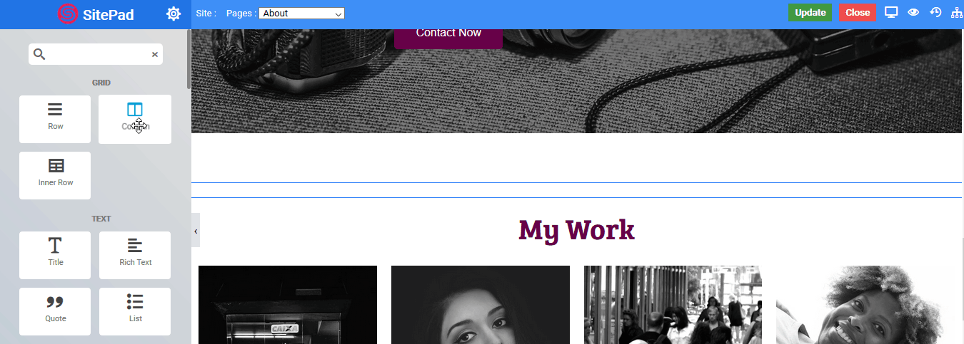
Grid System
Rows
Columns
Inner Row
Rows
Overview
Row Widget are wrappers for columns. A Row widget is used to display other widgets in a single div. When other widget are placed within the Row then it will simply display the other widgets that are visible within view.
Row Widget is an extremely important part of the page building process. They are containers that allow you to place any element, widget or content inside of them.
Options
- Container Width : Choose the width for the particular row eg – Auto (Width of the main Container), Full (Full width of the device), Fixed (as per user define),
- Row Width (Option only available for fixed-width) : Set the width for the row in px (pixel unit).
- Column Gap : Set the space between each column widget you use inside the row.
- Content Width : Set the max-width of the content inside the row eg – Auto (Width of the row), Fixed (as per user define), Full (Full width of the device).
- Fixed (Option only available for fixed-width) : Set the width for the row in px (pixel unit).
- Height : Set the height of the column eg – Default (original height of the row), Fit screen (as per the height of the user device), Min-height (minimum height as per user define).
- Min height (Option only available for Min Height) : Set the Min height for the row in px (pixel unit).
- Content V-align : Set the vertical alignment of an element inside the row eg- Default, Top, Center, Bottom Stretch.
Background
- Background Type : Choose the background for column eg – None, Video, Parallax.
- Video URL (Option only available for Video) : Set the column background to your choice of video.
- Image (Option only available for Parallax) : Set the column background to your choice of parallax image.
Background Overlay
There are two states of Background Overlay i.e. Normal which will always be visible and Hover background effects are visible on Mouse Hover.
- Delay (Option only available for HOVER) : Set the time it takes to appear. This time is in milliseconds, so 1000 ms is equal to 1 second.
- Overlay Type : Choose the type of overlay for column eg – None, Color, Gradient, Image.
Color Overlay
- Color : Choose the overlay color for the column.
- Transparency : Set the transparency of the overlay type.
Gradient Overlay
- Angle : Set the angle of the gradient color to be displayed from 0 to 360 degree.
- Color 1 : Choose the first gradient color.
- Percentage : Choose the percentage of the first gradient color to be displayed.
- Color 2 : Choose the second gradient color.
- Percentage : Choose the percentage of the second gradient color to be displayed.
- Color 3 : Choose the third gradient color.
- Percentage : Choose the percentage of the third gradient color to be displayed.
- Transparency : Set the transparency of the overlay type.
! NOTE
The percentage total of all three gradient color should not exceed 100 for it to work efficiently.!
The following is a screenshot to add a Gradient Overlay :
Image Overlay
- Image : Select the image you want to display as an overlay.
- Attachment : Set the image attachment type eg – Default, Scroll(Scrollable), Fixed(Parallax).
- Position – X : Set the horizontal position of the image for overlay eg – Default, Center, Left, Right.
- Position – Y : Set the vertical position of the image for overlay eg – Default, Center, Top, Bottom.
- Repeat : Set the overlay image to repeat itself if space is available eg – Default, Repeat (image will be repeated horizontally and vertically as per available space) , No-Repeat (image will not be repeated), Repeat-X (image will be only repeated horizontally), Repeat-Y (image will be only repeated vertically).
- Size : Set the size of the overlay image eg – Cover (image takes full available space), Contain (actual size of the image not exceeding column size).
- Transparency : Set the transparency of the overlay type.
The following is a screenshot to add a Image Overlay :

Shape Styles
Shape styles are unique effects you can use to enhance the visual appeal of your Rows. We support many styles and you can refer to How to create Shape Styles guide.The following shape options are available :
- Position : Select the position where you want to display shade.
- Type : Select the style of the shade you want to use.
- Color : Set the color of the shade style.
- Width : Set the width of the shade style.
- Heigth : Set the height of the shade style.
- Flip : Flip the shade to other direction.
Columns
Overview
Columns Widget are an extremely important part of the page building process. They are containers that allow you to place any element, widget or content inside of them.
They allow you to separate and organize content with ease. The intuitive interface allows you to easily adjust the column size on the fly with just a click. Creative design depends on columns and the options they offer, they allow you to insert background images, colors, borders, border styles/colors/ sizes, border positions on any size, column animations, control the overall gutter width between columns down to the exact amount you desire, add column links, hover effects and more. In addition, column widths automatically adjust the size based on the overall site width.
Content
- Content V-align : Set the vertical alignment of an element inside the widget eg- Default, Top, Center, Bottom.
- Widget Space : Set the space between each widget you use inside the column.
- Column Width : Set the width of the column from 1 to 12 or provide your custom width.
Background
- Background Type : Choose the background for column eg – None, Video, Parallax.
- Video URL : Set the column background to your choice of video.
Overlay
- Delay : Set the time it takes to appear. This time is in milliseconds, so 1000 ms is equal to 1 second.
- Overlay Type : Choose the type of overlay for column eg – None, Color, Gradient, Image.
Color Overlay
- Color : Choose the overlay color for the column.
- Transparency : Set the transparency of the overlay type.The following is a screenshot to add a Color Overlay :

Image Overlay
- Image : Select the image you want to display as an overlay.
- Attachment : Set the image attachment type eg – Default, Scroll(Scrollable), Fixed(Parallax).
- Position – X : Set the horizontal position of image for overlay eg – Default, Center, Left, Right.
- Position – Y : Set the vertical position of image for overlay eg – Default, Center, Top, Bottom.
- Repeat : Set the overlay image to repeat itself if space is available eg – Default, Repeat (image will be repeated horizontally and vertically as per available space) , No-Repeat (image will not be repeated), Repeat-X (image will be only repeated horizontally), Repeat-Y (image will be only repeated vertically).
- Size : Set the size of the overlay image eg – Cover (image takes full available space), Contain (actual size of the image not exceeding column size)
- Transparency : Set the transparency of the overlay type.The following is a screenshot to add a Image Overlay :
Gradient Overlay
- Angle : Set the angle of the gradient color to be displayed from 0 to 360 degree.
- Color 1 : Choose the first gradient color.
- Percentage : Choose the percentage of the first gradient color to be displayed.
- Color 2 : Choose the second gradient color.
- Percentage : Choose the percentage of the second gradient color to be displayed.
- Color 3 : Choose the third gradient color.
- Percentage : Choose the percentage of the third gradient color to be displayed.
- Transparency : Set the transparency of the overlay type.
! Note
The percentage total of all three gradient color should not exceed 100 for it to work efficiently.
The following is a screenshot to add a Gradient Overlay :
Inner Row
Overview
Inner Row Widget has same functioning as Row Widget. An Inner Row widget is used to create another row inside a Column to further divide it into more columns. Have a look at the following animated Gif to get an idea about the Inner row widget.

Options
- Container Width : Choose the width for the particular row – Auto (Width of the main Container), Full (Full width of the viewing device), Fixed (a width that you will define),
- Row Width (Option only available for fixed-width) : Set the width for the row in px (pixel unit).
- Column Gap : Set the space between each column you use inside the Inner Row.
- Content Width : Set the max-width of the content inside the row eg – Auto (Width of the row), Fixed (as per user define), Full (Full width of the device).
- (Option only available for fixed-width) : Set the width for the row in px (pixel unit).
- Height : Set the height of the inner row and its columns – Default (original height of the row), Fit screen (as per the height of the user device), Min-height (minimum height as per user define).
- Min height (Option only available for Min Height) : Set the Min height for the row in px (pixel unit).
- Content V-align : Set the vertical alignment of all the elements inside the Inner Row – Default, Top, Center, Bottom
Background
- Background Type : Choose the background for column – None, Video, Parallax, Slider.
- Video URL (Option only available for Video) : Set the column background to your choice of video.
- Image (Option only available for Parallax) : Set the column background to your choice of parallax image.
Background Overlay
There are two states of Background Overlay i.e. Normal which will always be visible and Hover background effects are visible on Mouse Hover.
- Delay (Option only available for HOVER) : Set the time it takes to appear. This time is in milliseconds, so 1000 ms is equal to 1 second.
- Overlay Type : Choose the type of overlay for column eg – None, Color, Gradient, Image.
Color Overlay
- Color : Choose the overlay color for the column.
- Transparency : Set the transparency of the overlay type.

Gradient Overlay
- Angle : Set the angle of the gradient color to be displayed from 0 to 360 degree.
- Color 1 : Choose the first gradient color.
- Percentage : Choose the percentage of the first gradient color to be displayed.
- Color 2 : Choose the second gradient color.
- Percentage : Choose the percentage of the second gradient color to be displayed.
- Color 3 : Choose the third gradient color.
- Percentage : Choose the percentage of the third gradient color to be displayed.
- Transparency : Set the transparency of the overlay type.
! Note
The percentage total of all three gradient color should not exceed 100 for it to work effeciently..
See the following screenshot to add a Gradient Overlay :

Image Overlay
- Image : Select the image you want to display as an overlay.
- Attachment : Set the image attachment type eg – Default, Scroll(Scrollable), Fixed(Parallax).
- Position – X : Set the horizontal position of the image for overlay eg – Default, Center, Left, Right.
- Position – Y : Set the vertical position of the image for overlay eg – Default, Center, Top, Bottom.
- Repeat : Set the overlay image to repeat itself if space is available eg – Default, Repeat (image will be repeated horizontally and vertically as per available space) , No-Repeat (image will not be repeated), Repeat-X (image will be only repeated horizontally), Repeat-Y (image will be only repeated vertically).
- Size : Set the size of the overlay image eg – Cover (image takes full available space), Contain (actual size of the image not exceeding column size).
- Transparency : Set the transparency of the overlay type.The following is a screenshot to add a Image Overlay :
Shape Styles
Shape styles are unique effects you can use to enhance the visual appeal of your Rows. We support many styles and you can refer to How to create Shape Styles guide.
The following shape options are available :
- Position : Select the position where you want to display shade.
- Type : Select the style of the shade you want to use.
- Color : Set the color of the shade style.
- Width : Set the width of the shade style.
- Heigth : Set the height of the shade style.
- Flip : Flip the shade to other direction.
Text Widgets
Title
Rich Text
Quote
List
Icon
Animated Heading
Title
Overview
The Title Widget is used to create stylish title headers for your page.
Customize your titles and headers efficiently with Title Widget. Choose how big you’d like to display your title, the text color, and it’s alignment. Customize from several options and set its color, as well.
Options
There are many options when you create a title :
Title
- Title : Type the text you want to display.
- Link to : Enter the link you want to be visited on click of title.
- Alignment : Choose the alignment of your text.


